CLIENT
Eduardo Gómez Úbeda
YEAR
2019
WHAT I DID
Branding
Eduardo Gómez Úbeda
YEAR
2019
WHAT I DID
Branding
El Individuo
A podcast in which self-created music is mixed to illustrate a path of personal development and awareness.
︎
The
Challenge
Eduardo Gómez Úbeda is a Spanish musician and coach who came up with the idea of making a personal development “album - book” and presenting it live with music perfom. He wants to use his resources to express and communicate his life experience in an inspiring way for others on their journey of self-discovery.
︎
The
Solution
From the beginning, one of the challenges was defining the project, which eventually ended up acquiring a podcast format and a YouTube channel. To do this, we created a contemporary identity that would collect, on the one hand, the essence of Eduardo's musical references, as well as transferring the main objective of the project: self-discovery. We also made sure to design a flexible identity that would accommodate both live presentations and different print and digital formats.

Moodboard
For the creation of the visual identity, we developed a moodboard in which graphic elements from the world of music and cinema were collected. We also included images that illustrate three of the main characteristics included in the brief:
︎︎︎ Complexity = outer & personal universe
︎︎︎ Harmony = Feeling self-realized
︎︎︎ Simplicity = Answers to our questions
︎︎︎ Complexity = outer & personal universe
︎︎︎ Harmony = Feeling self-realized
︎︎︎ Simplicity = Answers to our questions


Identity
basis
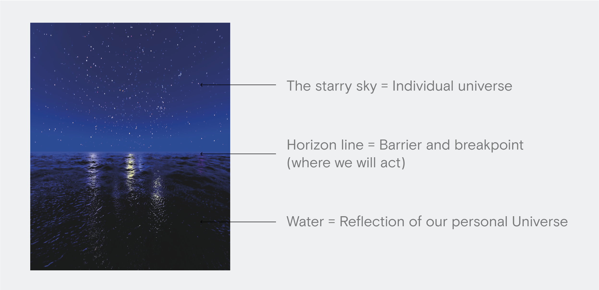
The phrase that will structure the entire visual identity is taken from an answer to a question in the brief:
“What would your project be if it were a landscape?
The starry sky from the ocean.”
This phrase allows us to create an image that contains:
︎︎︎The starry sky = individual universe
︎︎︎Horizon line = Barrier and breakpoint (where we will act)
︎︎︎Water = Reflection of our personal Universe
“What would your project be if it were a landscape?
The starry sky from the ocean.”
This phrase allows us to create an image that contains:
︎︎︎The starry sky = individual universe
︎︎︎Horizon line = Barrier and breakpoint (where we will act)
︎︎︎Water = Reflection of our personal Universe
Discovering the house
in the forest
Each of us contains an immense and complex Inner Universe, in addition to the complexity of the world around us.
Our wish is to clarify and help all those individuals with dreams, projects or concerns who want to carry them out and are looking for inspiration, keys or tools that underpin their determination and guide them along the way.
Our wish is to clarify and help all those individuals with dreams, projects or concerns who want to carry them out and are looking for inspiration, keys or tools that underpin their determination and guide them along the way.

"The design has to result from the perfect combination of complexity and simplicity, the beginning and the end."
Alejandro de Francisco
Typography
The selected typeface is Big Shoulders Display. This reminds us of the typography of posters and records. It has a diversity of thicknesses that allows us to create complex text bodies, in which typography plays a leading role. Typography allows us to adapt to different spaces, formats and sizes.


Color
The colors that we will use arise from the posters and records that we use as references. These colors allow us to have a diverse color range, making the visual identity have more personality. We have a range of warm colors and another range of cold colors.


Composition
The composition represents a translation of the previous image of the starry sky reflected in the ocean.
In almost all cases the identity will be built in relation to this division of information:
︎︎︎ Top: Photographs, more information
︎︎︎ Bottom: Color & Data (text)
Through this division of information we will coherently articulate all the visual identity in the different supports.
In almost all cases the identity will be built in relation to this division of information:
︎︎︎ Top: Photographs, more information
︎︎︎ Bottom: Color & Data (text)
Through this division of information we will coherently articulate all the visual identity in the different supports.

“The brand image we design has to help us inspire our audience.”
Eduardo Gómez Úbeda