CLIENT
Cafetería Industrial
YEAR
2019/2020
WHAT WE DID
UI-UX/Web/Development
TEAM
UX/UI DESIGNERS:
Alejandro de Francisco
Palula Rufi
Macarena Miranda
DEVELOPMENT & DESIGN:
Carlos Moret
Cafetería Industrial
YEAR
2019/2020
WHAT WE DID
UI-UX/Web/Development
TEAM
UX/UI DESIGNERS:
Alejandro de Francisco
Palula Rufi
Macarena Miranda
DEVELOPMENT & DESIGN:
Carlos Moret
Cafetería
Industrial
Cafetería Industrial is a cafeteria & restaurant in the Poblenou neighborhood in Barcelona. Created by Miquel Coulibaly, it is the stage where he creates his own universe. Our objective was to translate the experience of the local into a responsive web project, attending to its brand identity, its products and its values.


︎
The
Challenge
The main objectives were on the one hand to transfer the entire conceptual and aesthetic universe characteristic of Cafetería Industrial and on the other hand to always keep the user in mind at the center of all our decisions.
Another challenge was to create a sales service to the client that would ensure that the client understood the special dishes that are created in this place, at the same time that it allowed them to adapt to the daily gastronomic modifications proposed by the owner.
We knew that we would have to avoid creating a static website, trying to make the functionalities and transitions as natural as possible.
︎
The
Solution
We have created a website that highlights surprise, experimentation, the creation of new languages and the search for new ways of understanding digital platforms.
We have been inspired by a flat and industrial aesthetic, which has forced us to make an effort in the approaches of the different parts of the web and its elements, evaluating how these affect the user experience and their needs.
We have been inspired by a flat and industrial aesthetic, which has forced us to make an effort in the approaches of the different parts of the web and its elements, evaluating how these affect the user experience and their needs.

The Miquel
Universe
For Miquel Coulibaly Cafetería Industrial it is a stage that serves to creat his own universe where the gastronomic part, interior design, branding and creation take place in the same space. Talking to him, we discovered what were the main insights that articulated the idea behind the business:
→ IMPROVISATION
→ JAPAN
→ MULTIDISCIPLINARITY
→ IMPROVISATION
→ JAPAN
→ MULTIDISCIPLINARITY
"I embrace non-control in work processes as the key to constantly reinventing myself and seeking new and better ideas that result in better products"
Miquel Coulibaly

Research
& Modeling
We decided to obtain both qualitative and quantitative data, so we carried out an investigation that consisted of 80 interviews, a benchmark that analyzes different cafeterias with similar characteristics both locally and internationally, examining the relevance of their website in their business model and a series of interviews with local customers in order to know the most important insights.
Using the insights obtained in the research, we defined three personas who would represent the potential users.
Using the insights obtained in the research, we defined three personas who would represent the potential users.


Requirements
Modeling with People and Scenarios allowed us to obtain a list of requirements on how design should be and behave.
A strategic document that serves as a tool for communication between the team and for evaluating the process. We classify the main requirements in 3 categories.
A strategic document that serves as a tool for communication between the team and for evaluating the process. We classify the main requirements in 3 categories.

"In general I highlighted the food, I like the coffees, the desserts and the soups, I would love to know their recipes"
Customer
UI Design
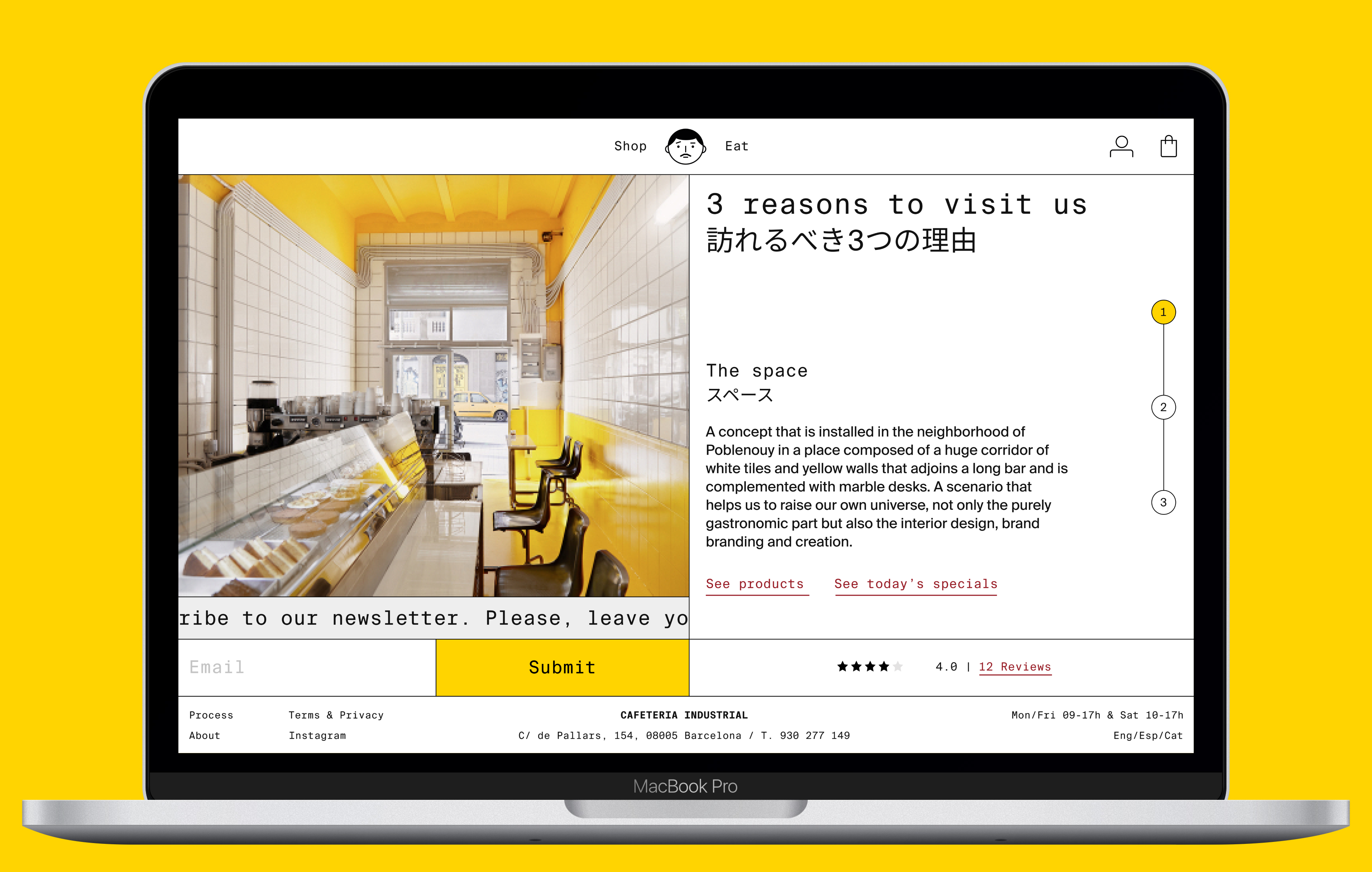
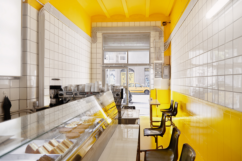
We have been inspired both by interior design, consisting of white tiles and yellow walls, industrial-style furniture and references to Japanese culture, as well as the design of the packaging of its products characterized by having a lattice structure, flat colors and linear icons , among which Miquel is iconographed, an icon that becomes the protagonist of the web with main functions such as going back to the home page or displaying a menu.


Bento Box
Throughout the project there is a persistence in representing and reflecting an industrial aesthetic, creating a very defined identity using a characteristic grid based on the Bento Box in which it serves its dishes, the combination between a monospaced typeface and a dry wood typeface, the yellow color and the design of iconographic elements that have made this website have its own aesthetic with a lot of character.
Home
The Home shows that there are two locations; Cafetería Industrial and Bocadillos Hanamura. That is why we divide the contents and even the main navigation menu, to reinforce the idea that there is Eat on the right and Shop on the left. Pop Ups are mobile and change information throughout the day.


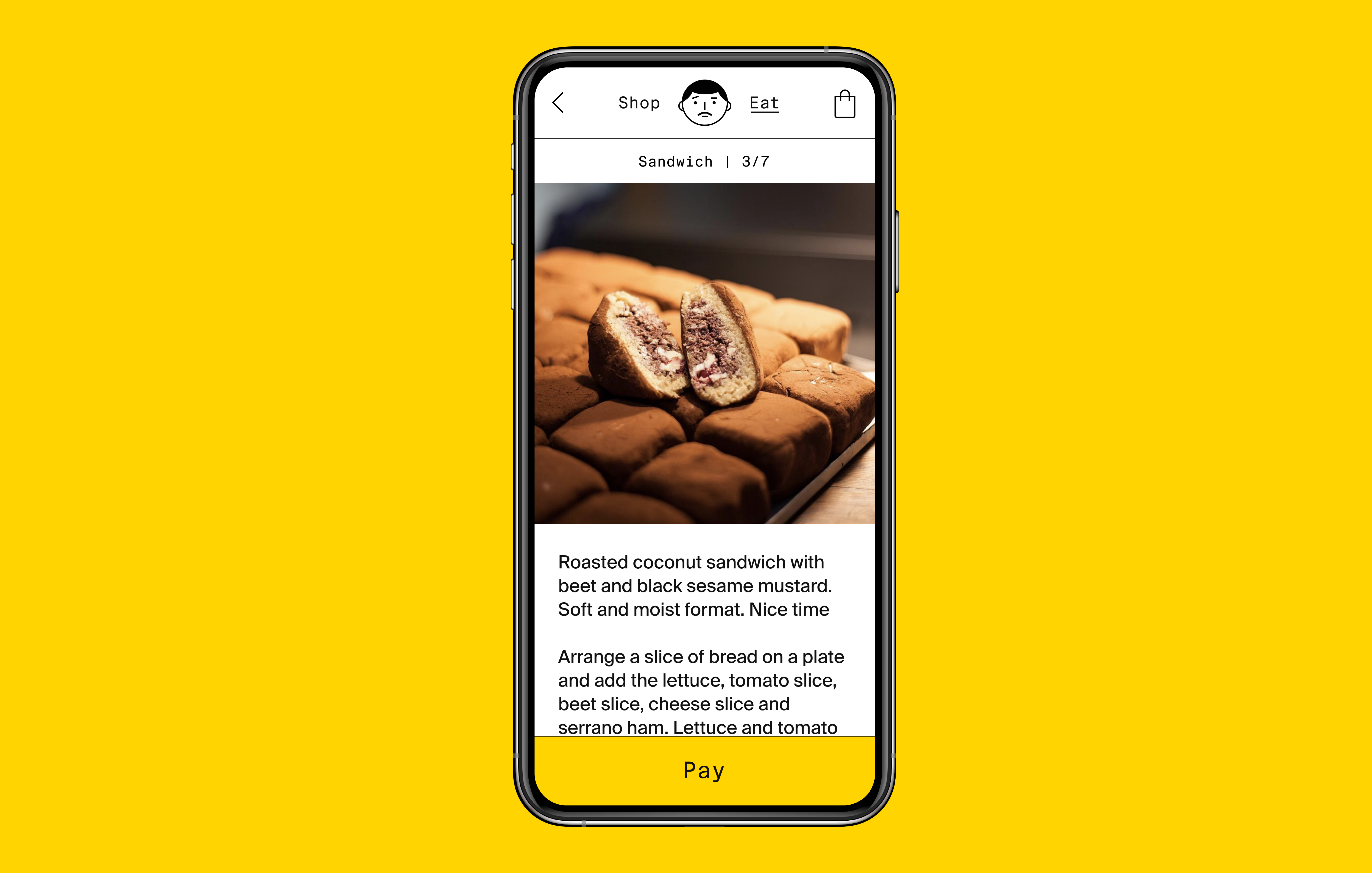
Eat
It´s divided by the menu where you can choose between three dishes, two drinks and two desserts. At the other end is information about the product in text and image format that is updated based on the buttons that are active. In the lower area appears the additional information of the dish and the reviews.


"Throughout the project there is a persistence in representing and reflecting an industrial aesthetic, creating a very defined identity using a characteristic grid based on the Bento Box"
The team
Shop
It is divided into two, at one end are the 9 products presented in scroll. On the right we use another scroll to display the product information, when clicking on a product the detail on the right is displayed, generating for the first time on the web the double scroll encouraging the user to explore and discover the products. There is always a call to action button visible when you have a selected product.


About
It is divided into two, at one end are the 9 products presented in scroll